Spring 2026 Color Trends: Pink, Butter Yellow & Cloud Dancer
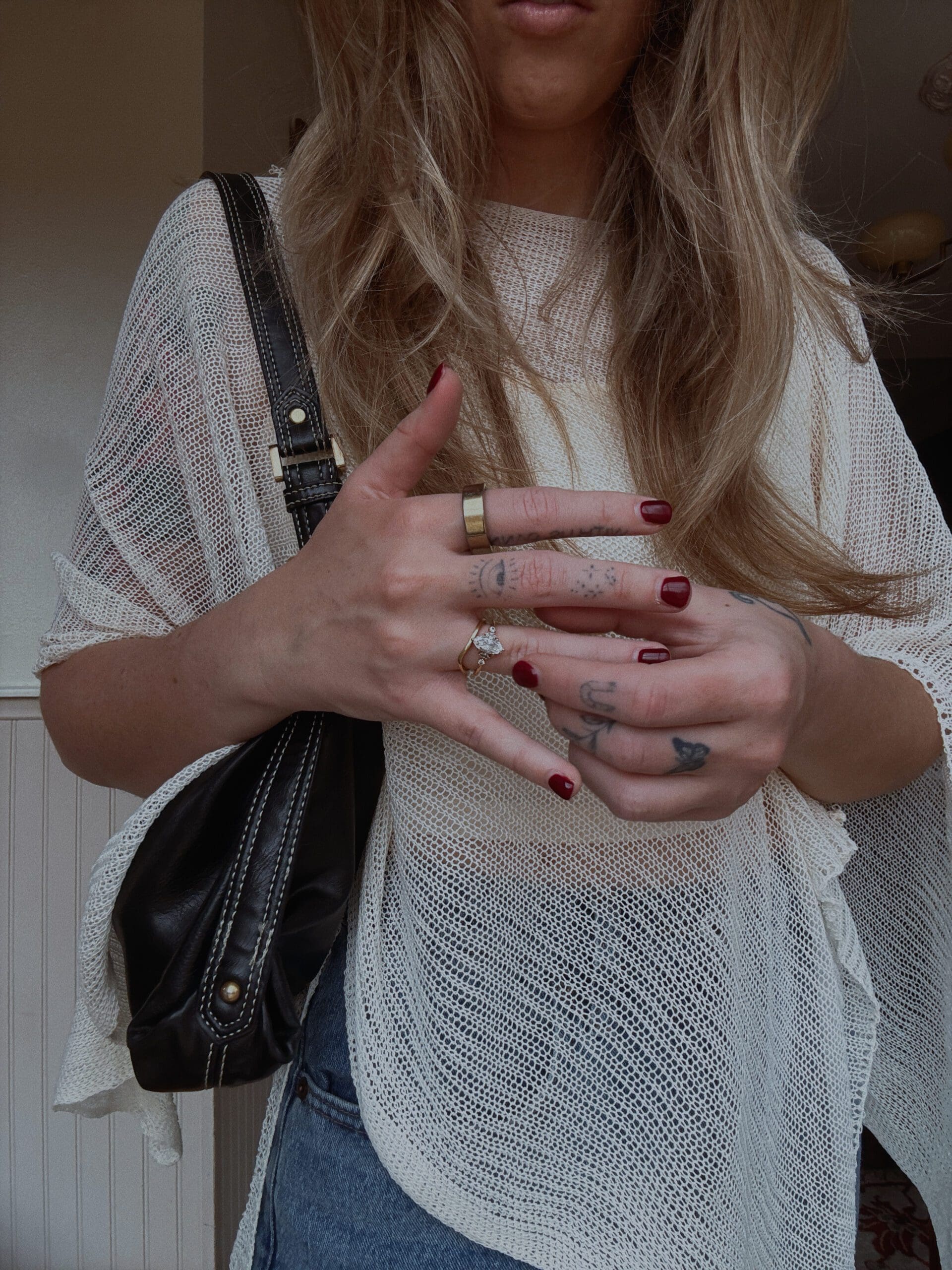
Spring 2026 color trends aren’t playing it safe. After years of quiet luxury beiges and moody neutrals, fashion is swinging hard toward vibrant, mood-boosting hues that feel intentional rather than accidental. The runways made it clear: color is back, and it’s not apologizing for taking up space.
This season’s palette runs the gamut from soft pastels to saturated brights, but three colors keep showing up everywhere—pink (in all its forms), butter yellow (and its bolder cousin, lemon yellow), and Pantone’s controversial 2026 Color of the Year, Cloud Dancer. Here’s how I’m working these trending shades into my Texas Hill Country wardrobe without looking like I walked off a runway or raided a baby shower.
Pantone’s 2026 Color of the Year: Cloud Dancer (And Why It’s Divisive)
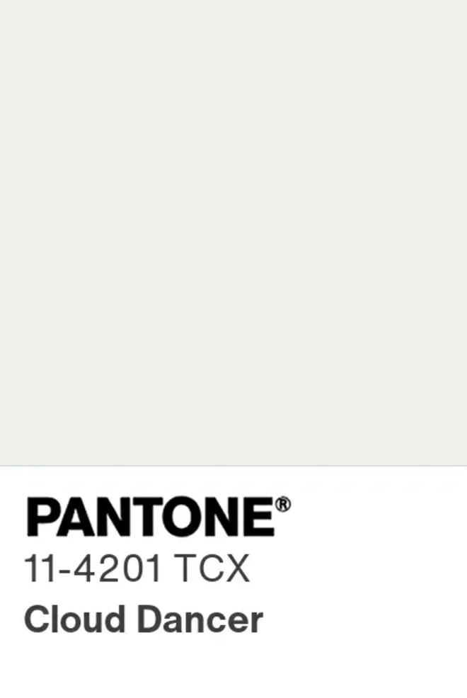
Let’s address the elephant in the room first. Pantone named Cloud Dancer—a soft, creamy off-white—as the 2026 Color of the Year, and the internet had thoughts. Many of them critical.
What Cloud Dancer Actually Is
Cloud Dancer (PANTONE 11-4201) is not stark hospital white. It’s a sophisticated off-white with subtle warmth, described by Pantone as “diaphanous” and “tranquil.” It’s the shade between pure white and beige—gentle, serene, and meant to evoke a fresh start and clean palette.
Think of it as the color your walls turn when natural light hits them just right. Not builder-grade contractor white, but an elevated neutral that feels intentional.
Why People Are Mad About It
Critics have called Pantone’s choice underwhelming, anticlimactic, and even “Pantone-deaf.” After bold picks like 2023’s Viva Magenta and 2025’s Mocha Mousse, choosing white feels safe to the point of boring. Design insiders pointed out that offering tips on incorporating white into your home is “about as useful as a tutorial on drinking water.”
Some called it the “Landlord Special.” Others questioned whether choosing white—already pervasive in retail, home interiors, and apparel—counts as a forward-looking statement or just confirmation of the status quo.
Why I’m Not Mad About It
Here’s the thing: Cloud Dancer is wearable. It’s not a color that demands you build an entire outfit around it. It doesn’t clash with anything already hanging in your closet. And for those of us who live in places where “spring” means 90 degrees by April, lightweight whites that aren’t see-through are actually useful.
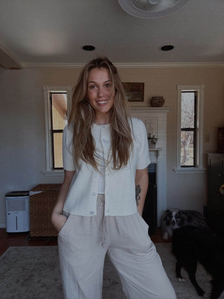
I already own several Cloud Dancer-adjacent pieces—cream linen pants, an off-white knit sweater, a soft white button-down. They’re not exciting, but they’re foundational. And in a year where bold color is trending everywhere else, having a neutral that plays well with everything feels practical rather than revolutionary.
How I’m wearing Cloud Dancer: Paired with thrifted denim, layered under a vintage western jacket, or as a base for statement jewelry. It’s not the star—it’s the supporting actor that makes everything else look better.
Pink: From Powder to Magenta, It’s Not Going Anywhere
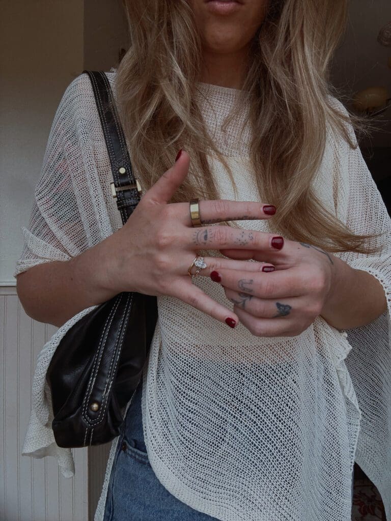
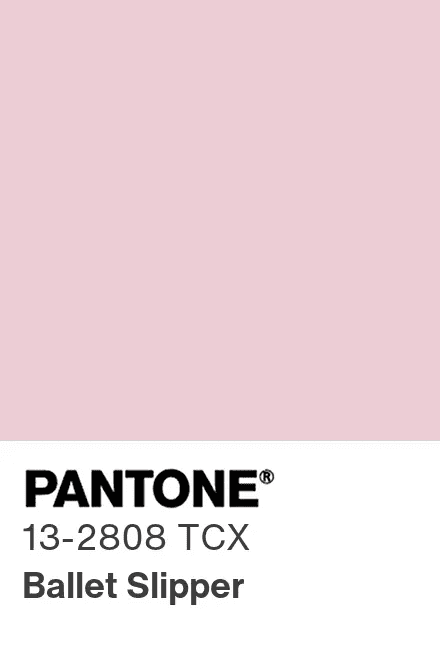
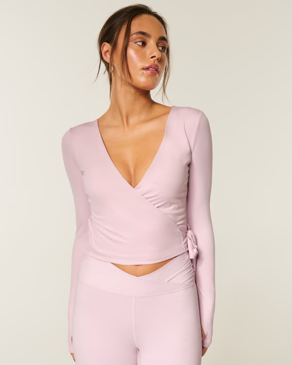
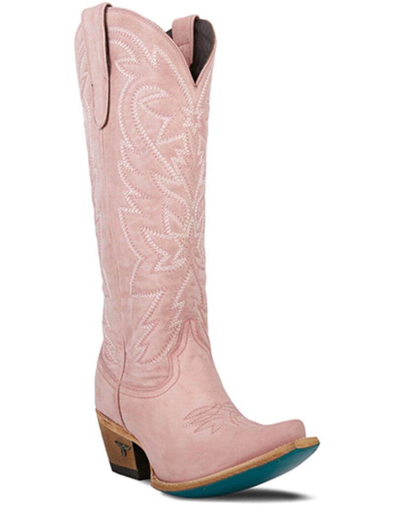
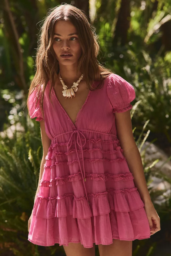
Pink dominated 2025, and it’s showing no signs of slowing down in spring 2026 color trends. But the shade is evolving. Powder pink and millennial pink are making way for bolder, more saturated iterations—think ballet slipper pink, candy pink, and full-blown magenta.
The Pink Spectrum for Spring 2026
Soft Pink (Ballet Slipper, Blush): Romantic, warm-toned, and easier to wear than you’d think. Designers are pairing it with burgundy, chocolate brown, and even true red for contrast.
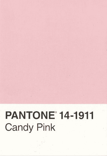
Candy Pink (Bright, Saturated): This isn’t your grandmother’s pink. It’s confident, punchy, and designed to make a statement. Think MM6 Maison Margiela’s head-to-toe pink looks or Burberry’s neon pink scarf layered over muted neutrals.
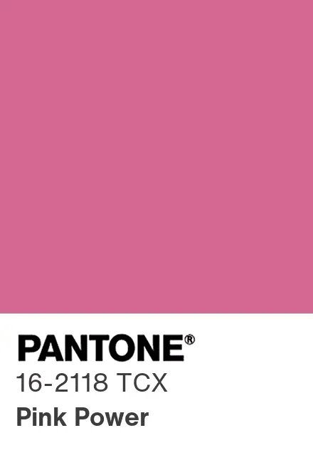
Magenta (Pink Power): Marina Cortbawi, founder of Merlette, described magenta as “saturated and confident…a real power color rather than just a romantic accent.” It’s pink with teeth.
How I’m Wearing Pink in 2026
I’ve always been ambivalent about pink, mostly because I spent the 2010s being told it was too girly or not serious enough. But 2026’s pink feels different—less apologetic, more deliberate.
I thrifted a rose-pink blouse last month that I’ve been wearing with dark denim and my favorite brown leather boots. It reads more “vintage western” than “Barbie dreamhouse,” which is exactly the vibe I’m going for. I’m also eyeing a magenta scarf to throw over neutral sweaters when I need a pop of color without committing to a full outfit.
The key to making pink work in Texas Hill Country style? Pair it with earthy tones. Pink and chocolate brown. Pink and olive green. Pink and denim. Let the landscape balance out the sweetness.
Butter Yellow (and Lemon Yellow): Sunshine in Fabric Form
Butter yellow had a moment in 2025, but spring 2026 is turning up the saturation. Enter lemon yellow—brighter, bolder, and impossible to ignore.
Butter Yellow vs. Lemon Yellow
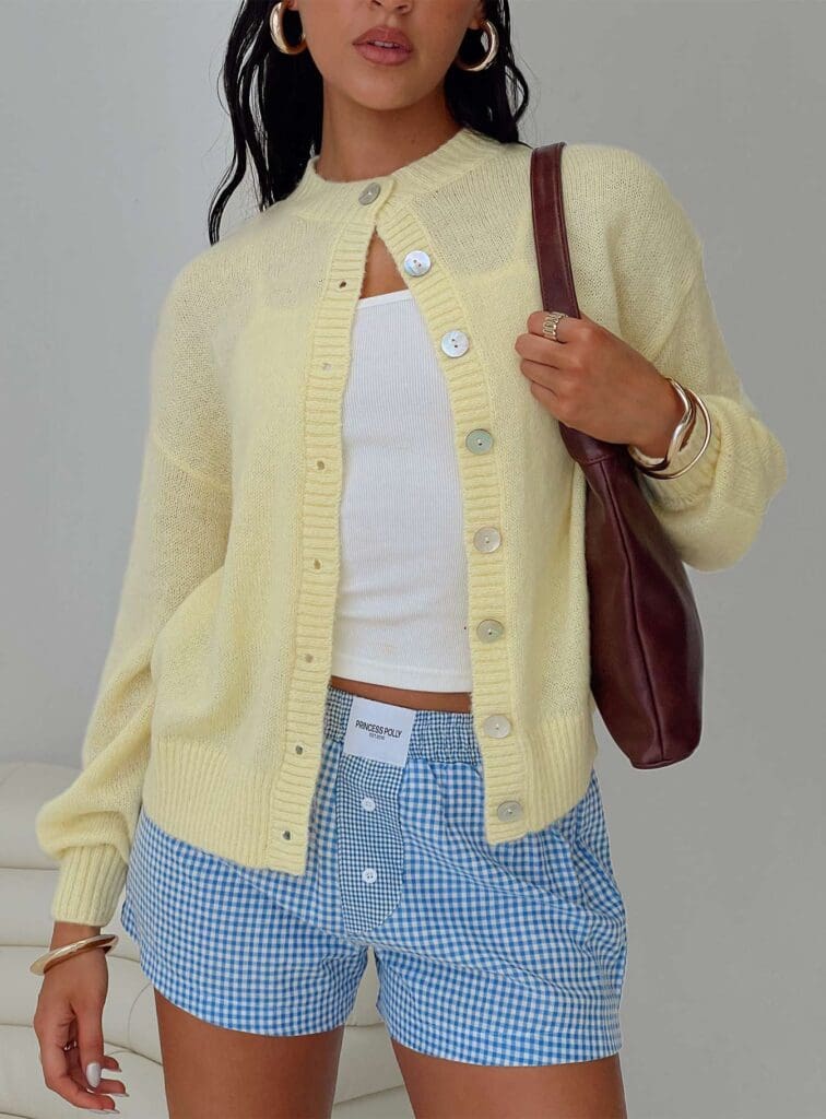
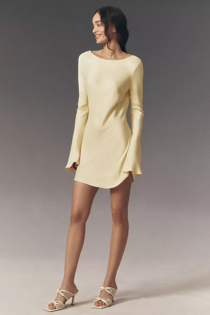
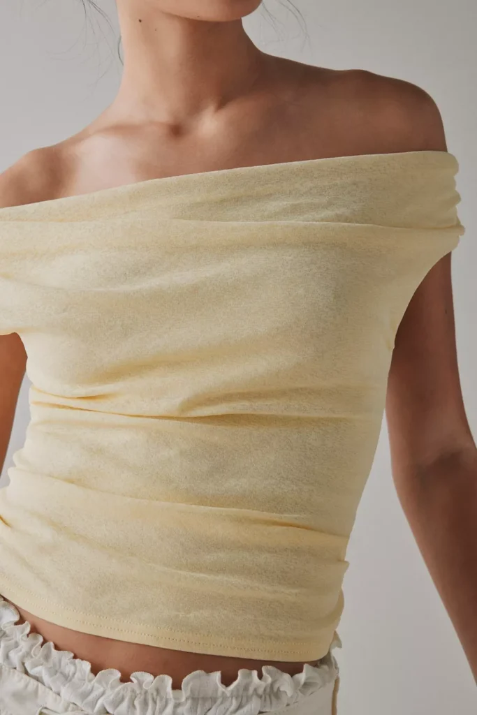
Butter Yellow: Soft, warm, buttery (obviously). It’s approachable, flattering, and easy to incorporate into neutral-heavy wardrobes.
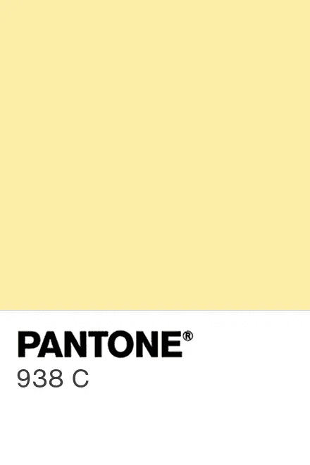
Lemon Yellow (Canary Yellow, Sunshine Yellow): Vibrant, high-contrast, energizing. This is the shade Bottega Veneta, McQueen, and Loewe championed on the runways. It’s not subtle.
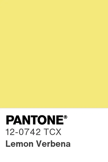
Trend forecasters are calling lemon yellow a “mood-boosting dopamine hit,” which is marketing speak for “this color makes you feel alive.” And honestly, they’re not wrong.
How I’m Styling Yellow
I’m not a full-yellow-outfit person. I don’t have the confidence or the complexion to pull off head-to-toe canary without looking jaundiced. But accessories? That I can do.
I found a butter-yellow crossbody bag at a thrift store in Fredericksburg that’s become my go-to spring accessory. It works with denim, with white, with olive green, with literally everything. Yellow accessories are the easiest entry point into this trend—shoes, bags, scarves, even sunglasses.
For those ready to commit harder, yellow paired with sage green is one of spring 2026’s hottest color combinations. It’s fresh, unexpected, and doesn’t feel as aggressive as yellow-on-yellow.
The Supporting Cast: Spring 2026 color trends Colors Worth Knowing
While pink, yellow, and Cloud Dancer are the headliners, a few other shades are making serious moves this season.
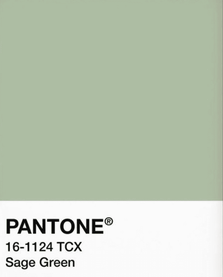
Sage Green (The New Navy)
Soft, earthy sage green is being called “the new navy” for 2026. It’s neutral enough to go with everything but fresh enough to feel current. I’ve been seeing it everywhere—pants, sweaters, accessories.
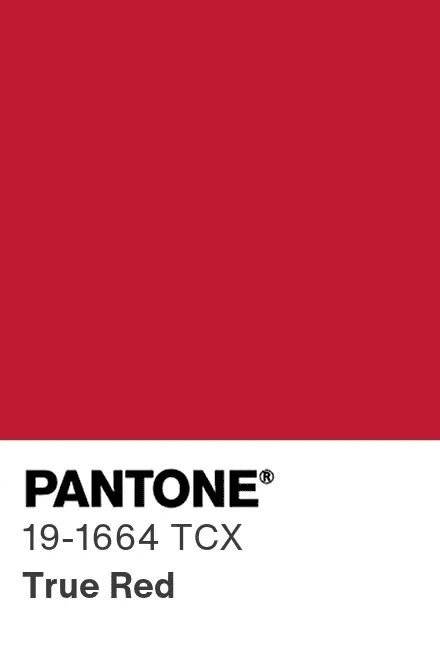
True Red (Bold, Unapologetic)
Fire-engine red showed up on runways at Valentino, Chanel, and Prada. It’s not burgundy, not oxblood—just pure, saturated red. Confident and impossible to ignore.
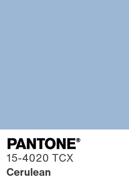
Cerulean Blue
Bright, saturated blues—especially turquoise and cerulean—are having a moment. They’re showing up in outerwear, accessories, and statement pieces. Paired with chocolate brown or espresso, they feel grounded and wearable.
How to Actually Wear Spring 2026 Color Trends (Without Looking Like a Pinterest Fail)
The problem with trend reports is they show you runway looks and celebrity street style, which are not useful if you’re a real person living a real life. Here’s how to make these colors work in practice.
Start with Accessories
The lowest-commitment way to test a trend is through accessories. A yellow bag. Pink earrings. A Cloud Dancer scarf. See if you actually reach for them before investing in a full outfit.
Pair Bold Colors with Neutrals
Don’t feel obligated to color-block like the runway models. One bright piece + neutral basics = wearable. Pink blouse + denim + brown boots. Yellow bag + white tee + jeans. Cloud Dancer pants + thrifted graphic tee.
Thrift First, Buy New Second
I’ve found some of my best color pieces at thrift stores—vintage pink blazers, butter-yellow scarves, cream linen pants. Thrifting lets you test trends without dropping serious money, and you’re more likely to find unique pieces that don’t look like everyone else’s.
Consider Your Landscape
This is specific to living in Texas, but it applies anywhere: what colors already exist in your environment? Here, that’s dusty greens, warm browns, limestone grays, bluebonnet blues. Colors that complement those tones (yellow, pink, cream, sage) feel natural. Colors that fight them (neon orange, electric purple) feel forced.
Ignore What Doesn’t Serve You
Not every trend is for every person. If lemon yellow makes you look sick, don’t wear it. If pink feels performative, skip it. The goal isn’t to dress like a runway model—it’s to look like yourself, but slightly more current.
My Spring 2026 Color Strategy
Here’s what I’m actually incorporating into my wardrobe this spring:
Committed to: Butter yellow accessories, soft pink paired with earth tones, Cloud Dancer as a neutral base, true red statement pieces
Testing: Lemon yellow in small doses, sage green accessories, pink + burgundy color blocking
Passing on: Full turquoise looks, head-to-toe pastels, anything that requires me to buy an entirely new wardrobe
The beauty of spring 2026’s color trends is that they’re not prescriptive. You don’t have to wear all of them or even most of them. Pick the shades that make you feel good, ignore the rest, and remember that thrift stores are full of past trends waiting to become current again.
Frequently Asked Questions About Spring 2026 Color Trends
Top spring 2026 color pairings include: pink + burgundy, butter yellow + sage green, turquoise + chocolate brown, true red + Cloud Dancer white, and ballet pink + true red.
Cloud Dancer is a soft off-white—not stark white, but a creamy, warm neutral that sits between pure white and beige. It’s more sophisticated and gentle on the eyes than builder-grade white.
Butter yellow is a soft, warm, approachable shade that’s easy to wear. Lemon yellow (canary yellow) is brighter, more saturated, and higher contrast—it’s the bolder, more energizing version of the same color family.
Butter yellow pairs beautifully with sage green, olive green, denim, chocolate brown, and Cloud Dancer white. For a bolder look, try butter yellow with turquoise or true red.
Pair pink with unexpected colors like burgundy, chocolate brown, or true red instead of traditional pastels. Opt for saturated, confident pinks (candy pink, magenta) over powder pink for a more current look.
Pantone’s 2026 Color of the Year is Cloud Dancer (PANTONE 11-4201), a soft, creamy off-white that’s meant to evoke tranquility and serve as a fresh neutral base.
Yes, butter yellow is still trending in 2026, but it’s being joined by its brighter cousin, lemon yellow (also called canary yellow or sunshine yellow). Both shades are popular for spring fashion.
The biggest spring 2026 color trends include pink (from soft blush to bold magenta), butter yellow and lemon yellow, Pantone’s Cloud Dancer (a soft off-white), sage green, true red, and vibrant blues like turquoise and cerulean.